

EW is one of those paints that, although, they’re going for SW color of the year 2022, we believe will be widely used all across the country for a long while to come since EW will work in anything from kitchen islands all the way to full home exteriors. Grey-green – the grey-green shade looks light, warm and really goes with anything. It’s really just a touch over 30 on theLRV;so it’s a gray that’s just dark enough to make you feel safe,secure,and comfortable,yet light enough that it won’t suck your space up.
EW is a paint that, though it’s being called SW color of the year 2022, will prove to still be used across the nation a lot after that due to it working for kitchen islands to full home exteriors.
The colors works well for the masses, almost everywhere-but not quite and that’s why.
That’s the part most write-ups skip. Evergreen Fog Sherwin Williams isn’t hard to use because it’s a bad color — it’s hard to use because it genuinely looks different depending on where you put it, and a lot of the disappointment people report (“it went blue,” “it looked gray, not green”) traces back to lighting conditions nobody warned them about.
What Evergreen Fog actually looks like

The technical numbers: hex
#95978A, RGB 149/151/138, LRV approximately 30. That LRV places it solidly in the medium range — for comparison, a crisp white trim color typically sits at LRV 80+, while a near-black like SW Iron Ore sits around 6. At 30, Evergreen Fog absorbs more light than it reflects, so a room painted in it will read noticeably deeper and cozier than one painted in a pale sage.
And colorwise, it is a green-gray, that is tinged with some blue and with underlying warmth, which really does contribute to it having an elusive and unnamable quality for most people. Sherwin-Williams actually labels it a green-gray with touches of blue. Daylight which is natural and warm also seems to lend to the green and allow it to pop which can bring about an earthy, leafy feel. A room in a colder setting or with northern facing window, this cool blue-grey will dominate, giving you the most powdery blue-grey, smoky effect. Neither read is “wrong” — it’s the same paint doing what green-grays do.
Where it works best
Evergreen Fog earns its reputation in a few specific applications more than others:
Kitchen cabinets and islands. This is arguably the color’s single most popular use since 2022. strikes me as an elevated choice for white or gray cabinetry, especially with shaker door styles and then brass or matte black cabinet hardware that pulls out the warmer tone or sharpens contrast respectively. Amongst all the two-tone schemes going on right now (islands or lowers on Evergreen Fog, uppers on a crisp white, lowers on a soft white, etc.) I bet this might be one of the most requested ones.
Bedrooms. The calm, medium LRV – lighter and less imposing than heavy. That’s why you see so many of these in main suites and children’s rooms. Mix it in with warm white linens and wood finishes and it makes a relaxing yet not too dark feel.
Built-ins, doors, accent walls. For anyone nervous about committing a whole room to a saturated color, Evergreen Fog on a single door, a fireplace surround, or a wall of built-ins is the lower-risk way to try it — you get the character without living inside it.
Exteriors. Full sun is fairly liberal. Outdoor colors almost always seem one or two shades lighter than on the paint chip. This is, mostly, why Evergreen Fog can never look too dark as an exterior color in relationship to farmhouse, craftsman and cottage design. It’s commonly paired with a warm trim white and either black or bronze window frames.
Where it’s a riskier choice
It’s not a color for every room, and pretending otherwise does readers a disservice.
In a room with very little natural light — a windowless powder room, an interior hallway, a basement with only artificial lighting — Evergreen Fog can slide into a flat, slightly murky gray that loses the green character that makes people choose it in the first place. If the room’s fixed elements are already cool-toned (gray tile, cool marble, stainless steel-heavy kitchens), the color’s blue undertone can amplify that coolness rather than balancing it. And if you’re trying to brighten a small, dim room, an LRV of 30 is working against you — a color with an LRV in the 50s or higher will do that job better.
The undertone problem, explained simply
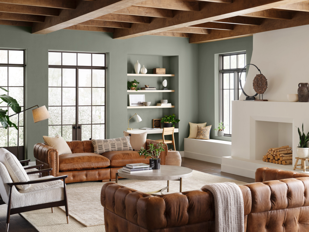
Under every paint color is a secondary hue or “undertone” disguised beneath the surface color, visible in different lighting. This color has blue gray nested very tight under the surface with a whisper of gold at a surprising spot as the other colors would either be green gray on top or the underlying gray at the surface. Which is why it is named Chameleon .
Well, practically though, this all just means that if you look from a certain direction it will just appear a bit more greener:.
Rooms which face south and west will pick up a warmer, directional light and it is the ones facing west and south that are most likely to bring the green and gold to the foreground.
On north- and east-facing rooms the light is cool, flatter and pulls the blue-grey forward.
Artificial light (especially bright white/cool light LED’s) moves the light towards a gray, but warm light sources will move towards the green.
If you only look at a sample chip under a store’s fluorescent lights, you’re seeing one narrow version of a color that changes meaningfully with the conditions in your actual room.
How to actually test it
A 2-by-3-inch chip taped to a wall tells you very little about a color this light-sensitive. A more reliable approach:
Paint (or stick) a sample at least a foot square, on more than one wall, and look at it at three points in the day — morning, midday, and evening — plus once after dark with your normal lighting on. If you’re deciding between walls and cabinets, test both in the same session, since cabinet lighting (often under-cabinet LEDs) can make the color behave differently from a wall a few feet away.
Colors coordination
There was also a whole really authentic, scheme of coordinating colours anchored by Evergreen Fog that launched the 2022 Sherwin-Williams Colormix Forecast, it wasn’t a collection of random groupings, instead you had Shoji White (SW 7042), Urbane Bronze (SW 7048), Accessible Beige (SW 7036), Ber Umber (SW 9107), Woven Wicker (SW 9104) and Bakelite Gold (SW 6368).
White #1 – Chantilly Lace (Benjamin Moore 1430) With regards to trim and ceiling use, these three whites always popped up in real world projects and do very distinct things:.
White Undertone Best for
Pure White (SW 7005) Soft, slightly warm The safest all-purpose trim pairing; enough warmth to avoid a stark contrast
Alabaster (SW 7008) Warm, creamy Traditional or farmhouse spaces, and exteriors where you want a cozier white
Extra White (SW 7006) Cool, bright Modern spaces where you want the green to pop against real contrast
Evergreen Fog and Accessible Beige

This specific pairing comes up often enough to deserve its own answer: yes, they work well together, but as two separate zones of color rather than blended on the same surface. Accessible Beige is a warm, versatile greige, and it’s part of Sherwin-Williams’ own coordinating palette for Evergreen Fog Sherwin Williams. A common, effective combination is Accessible Beige on the main walls of a room with Evergreen Fog reserved for a lower-commitment surface in the same space — a vanity, a built-in, an island, or a door. The beige keeps the room feeling neutral and light, while the green adds depth without competing with it. Painting both colors on adjacent large wall surfaces in the same room is possible but riskier, since their undertones can either read as a nice warm-cool balance or as slightly muddy, depending on your lighting — test it before committing.
How it compares to similar colors
Evergreen Fog isn’t the only gray-green worth considering, and knowing where it sits next to its closest relatives makes the decision easier:
SW Acacia Haze (SW 9132) is a lighter, grayer sibling in the same family — a good choice if Evergreen Fog tests too dark or too green in your space but you still want that muted quality.
SW Sea Salt (SW 6204, LRV ~63) is a much paler, airier green-gray. Choose this over Evergreen Fog if you want a soft wash of color rather than a defined, grounding one, or if your room doesn’t get much natural light and you need something that stays bright.
SW Dried Thyme leans more solidly green with less gray, and reads more confidently “green” in every light — a better pick if Evergreen Fog’s chameleon quality bothers you and you’d rather it just look green.
SW Anonymous (SW 7082, LRV ~20) is a noticeably darker, more dramatic green-gray. If Evergreen Fog feels like it’s not making enough of a statement, this is the deeper option in the same family.
Interior or exterior — does it change how the color reads?
Yeah that’s a good plan for place too. Indoors, artificial lighting and a room’s orientation dominate how the color reads, for the reasons above. Outdoors, direct sunlight is far more generous, which is why exterior applications of Evergreen Fog consistently read lighter and softer than interior ones, even at the same LRV. If you’re using it both on your exterior and on an interior surface you want to visually connect — a front door and a mudroom bench, for example — expect the exterior version to look a shade or two brighter, and don’t be surprised if you need to look at both in person before deciding they truly match.
Basically,
Evergreen Fog, however is obviously up there because that one, which comes in at aLRV of 30. It is actually dark enough to be on purpose, but it doesn’t really feel heavy. Its green shifting undertone gives it depth so it doesn’t look flat. It is very nice for kitchen cabinets, bedrooms, north side of house receiving bright light, accent wall or the face of an accent item where you’d like to bring warmth to a spot without totally committing to it. Best to avoid in any dark room without any light (a dark north facing room, if trying to get extremely bright). Test a large sample in your actual room, at different times of day, before you commit — with a color this responsive to light, that one step prevents most of the regret people report after painting.
(FAQs) About Evergreen Fog Sherwin Williams
1) What are the undertones of Evergreen Fog?
Has gray with a hint of blue with a hint of a warm / yellow-green tone to the base .
2) What color is Sherwin-Williams Evergreen Fog?
this is a subdued/faded green-grey/sage green.
3) Is Evergreen Fog too dark?
Not usually. This is a medium depth colour with around 30 LRV. Under a low light situation however, it may appear a darker shade.
4) What colors work well with Evergreen Fog?
Similar options include SW Acacia Haze, SW Illusive Green, SW Cornwall Slate, and Benjamin Moore October Mist.
5) Is Evergreen Fog still popular?
Yes. It remains popular even though it was Sherwin-Williams’ 2022 Color of the Year.




Comments 1